CONTACT US
Domo Data Visualizations: A Complete 5-Step Guide

Effective data visualization represents the difference between information overload and actionable insights. As an analyst, CEO, CFO, or head of marketing, everyone needs to access your data quickly, to analyze it efficiently, and to make sound decisions based on what you see. Enter Domo data visualization. With Domo, the original and leading cloud-native analytics platform, visualization is easy to set up and easy to consume. However, as always you must have good data in the right structures to optimize the visualization process. In this article, we cover the essential steps to prepare your data for visualization, and how to select the right visualization for your data.
Step 1: Planning Your Domo Data Visualization
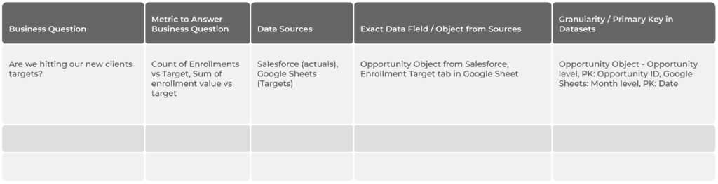
Before preparing your data for visualization, you must identify which exact target analytics you need to build. At Graphable, we refer to this as “metric mapping”. Metric mapping is an exercise to outline exactly what your Domo data visualization will convey.
First, start with what business questions you are trying to answer. Next, identify the 2-3 metrics that will answer each business question. Lastly, outline what data you need for each of those metrics.
For each metric, be sure to specify the exact tables and fields within the data source(s) you need. For example, it is great to know that we need data from Salesforce. But before you begin development, take the time to outline exactly which objects and fields from Salesforce we need for each metric. While it be time-consuming, a thorough metric mapping exercise ensures a more efficient balance of the data visualization build.
Often when you getting ready to build out analytics, many prefer to start by immediately gathering all the data that they can into a warehouse. Though that can feel productive initially, they can often end up in a holding pattern with what to do with all that data. Or they end up going further and building out analytics that seem helpful but that are seldom used.
Identifying the business questions and then metrics first gives a clear path and direction to what data we need and what we need to do with it. The 3-step process outlined in this article focuses on the end goal first- which metrics our stakeholders need to make better decisions- and then works backwards towards the data we need to access.
Step 2: Transforming Your Data
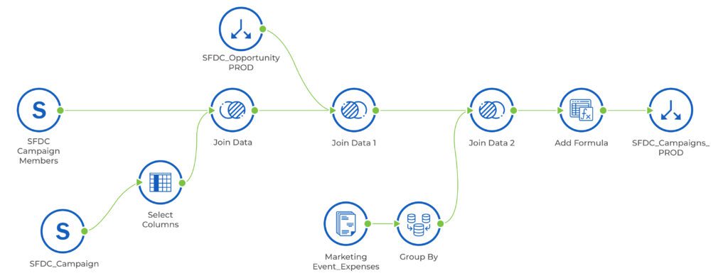
Once the metrics are mapped out, it is time to connect and transform the data. We should pull in just the data outlined in the metric mapping, giving us all the fields we need for our Domo data visualization. To connect the data, we will often use one of Domo’s library of over 1,000 prebuilt connectors. If a prebuilt connector is not available, we look to use a Domo JSON connector, SFTP connection, email, or Domo custom connector.
With the data now available to Domo, we will transform that data in the best-in-class low-code / no-code ETL (“MagicETL“) or in a the Domo data flows SQL UI. In the dataflows we create, we will first clean the data from each source, and then join it together. To clean the data, this often involves removing duplicate entries, filling or removing cells with missing or invalid data, rectifying errors, and ensuring your data and fields are uniform across all your data sources.
After cleaning your data, the next step in the transformation is often joining two or more datasets together. When joining data, ensure that the join keys are the same syntax and Domo data type. Also ensure that the join won’t cause unwanted duplicates in the data. You may need to aggregate or group one or both datasets before you can join them together.
After joining the datasets, you may still need to transform the data further. The only way you’ll know this is if you already have a clear understanding of how you’ll build the metric, from the metric mapping exercise.
For example, if you know you are building a pie chart, you’ll need one column with the pie values, to calculate the percent of the whole, and one column with the categories, to display what the name of each pie section is. We often refer to this as making your data “vertical”, as you end up with a taller table consisting of fewer columns (usually a category/label column and a value column), as opposed to “horizontal” with many metric columns, where the metric name is often the column name.
When the metric mapping and transformation steps are done well, the remaining steps in your Domo data visualization work are quick and smooth.
Step 3: Selecting The Right Visualization For Your Data
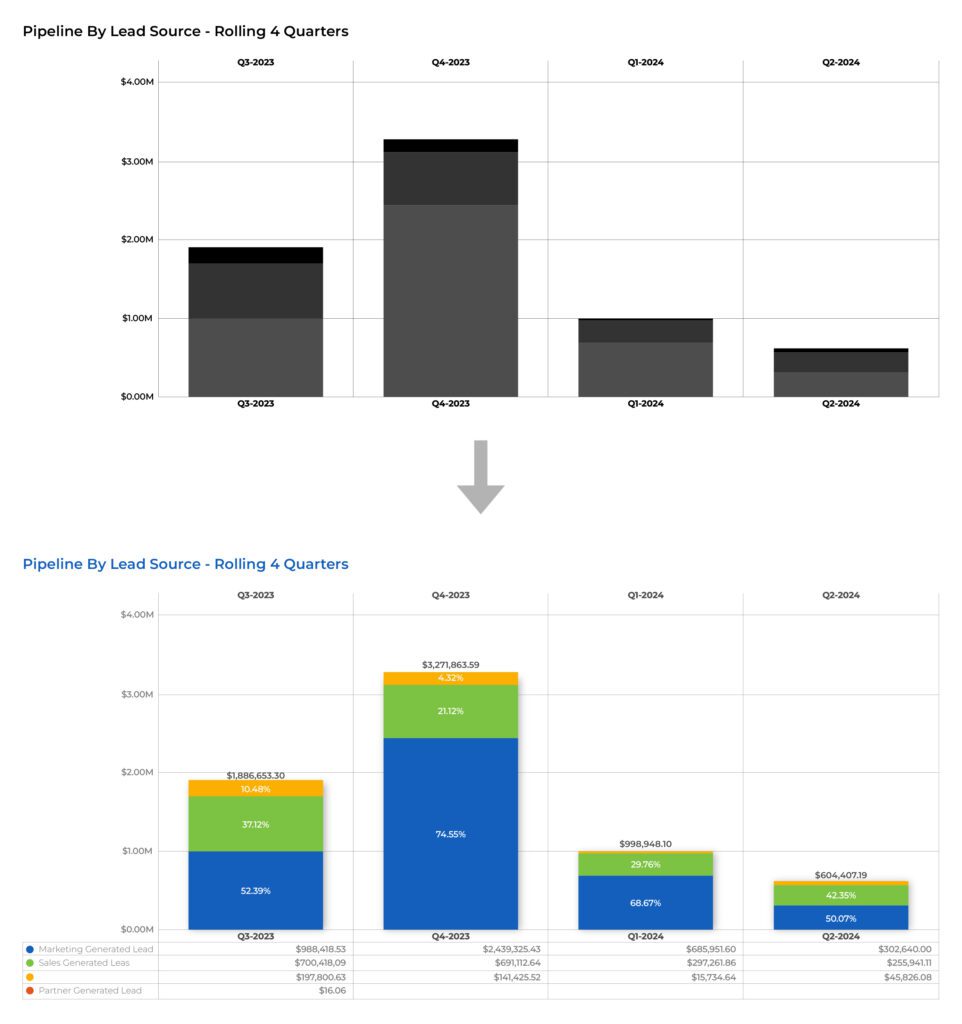
The next important step is choosing the right visualization for your data. Data visualization is about translating data insights into a visually suitable presentation that best suits your data characteristics and purpose. This will ensure that the message is delivered effectively with maximum impact.
There is certainly a lot of debate about making them visually appealing for the sake of it vs minimizing anything (e.g. color for the sake of being attactive) that does not contribute to driving further insights from and understanding of the underlying data. The best explanation and in strong support of maximum simplicity are the arguments from well-known expert Stephen Few. He even goes so far as to argue that most if not all data can be optimally represented in some variation of a table, dot, line or bar chart of some kind . See here for his explanation matrix.
In the metric mapping process, you may have specified exactly what chart type your Domo data visualization should be. However, it is common to not know the exact format of the metric yet. You have an idea of what it should convey, but there are so many Domo data visualizations available, it is common to play around with multiple chart types to find the best one. For more detailed help on how to choose the right chart, read this article or look here for a list of one page infographics to help.
In Domo there are so many visualizations to choose from, each with its own strengths and weaknesses, which can often depend on the shape of the data itself. Choosing the right visualization for your data is essential to driving insight and understanding and more effective decision-making from the data. Some examples of common visualization types include:
- Bar Charts: These are suitable for displaying numerical comparisons between different categories or subcategories.
- Line charts: These are suitable for displaying trends and show how numerical data changes over time. A common misstep we see is using a line chart when the data is not actually a trend. Such as when the X axis is categories, instead of a date.
- Heat Maps: These are suitable for showing correlation and highlighting areas with the highest or lowest values in a specific dataset.
Here are a few less common Domo data visualization types:
- Sunburst: Ideal for showing hierarchical relationships. Each hierarchical level is represented as a ring. The innermost ring represents the top level of the hierarchy, and each progressive ring outward from the center represents a level down from the top level, with smaller segments representing a portion of their parent in the hierarchy. The relative size of any segment represents the value of that segment. You can include up to 5 rings in any Sunburst graph.
- Waterfall: Waterfall graphs are bar graphs that show a series of profits and losses for a specified time period, with a summary bar showing the amount remaining at the end of the time period.

- Sankey: Sankey charts are a type of flow diagram in which the thickness of the connecting lines between elements is proportional to the flow rate. They are great for showing cost breakdowns, inventory flows, web traffic, and more.
- Radar: Great for ratings of a category and most useful when the exact value is not as importance as the relative value to the other objects in the category. Best for quickly slowing outliers and shows best with a series of 3 or 4.
For a complete list of Domo data visualizations (which is well over 100 now), check out this regularly updated table of contents that starts with them grouped by type.
Step 4: Customizing Your Visualization
After you’ve chosen the right visualization type to fit your data, you then customize it. Customizing your visualization involves creating an optimal look and feel so that it fits your brand especially when customer facing, and most importantly so that it most effectively communicates insights.
Customizing a Domo data visualization is easier than ever, with drag-and-drop and configurable features available for every need. Domo Analyzer is one of the most powerful capabilities in the Domo platform, enabling you to quickly bring your data to life.
You may have noticed that steps 1-3 would likely take most of the time and effort. We see the most success when clients recognize this and take our advice to put the time and focus up front to outline what they need, to understand/map it and then to gather and transform the data reliably. We tell all our clients that if you’ve done the metric mapping and data wrangling well, well, then the Domo Analyzer enable the cards and dashboards to come together very quickly.
Step 5: Practice and Iterate
With all the data cleaned, formatted, and visualized, it’s vital to iterate. A card and a dashboard are rarely ever “done”. The practice of analyzing, improving, and adjusting the visualizations, with the aim of finding new insights, improving processes, and making smarter business decisions, is a continuous cycle.
As your business grows, teams and roles change, processes improve, you should periodically circle back to your Domo data visualizations and ensure that they are showing key metrics in the best way so users can make better business decisions. Ask yourself if there are new data sources that could add value to the metrics or dashboards. Are there drill downs we can configure to get more granular information? Do we need to share this with a larger audience now that the team has grown?
Conclusion: Domo data visualization
Domo is a powerful analytics platform that has plenty of features and functionalities for data visualization. However, to make the most of Domo’s visualization capability, you need to ensure that your data is well-organized and presented in the optimal visualization. By implementing the processes outlined in this article, you can maximize the value of your data. At Graphable, we have a team of experienced data experts that can guide you through the process of transforming your data into actionable insights.
For related analytics and Domo-specific topics, check out these articles
- What makes a compelling business intelligence dashboard?
- Domo vs Tableau – What are the differences?
- Learn the difference between Domo vs Power BI
- Domo demo video
- What makes a great business intelligence consultant?
- Best BI solutions?
- What is Domo analytics?
- The Domo Platform
- Domo dashboards
- Dashboarding – what it is is and how to begin
- What are digital dashboards?
- Domo maps,
- Domo analyzer (KPI builder and ad hoc UI)
- Domo Workbench
- Domo custom connector – how to
- Build a Domo JSON connector
- Domo variables
- Domo everywhere
- Create a Domo app
- The power of Business Intelligence Services
- Financial Business Intelligence
Graphable helps you make sense of your data by delivering expert data analytics consulting, data engineering, custom dev and applied data science services.
We are known for operating ethically, communicating well, and delivering on-time. With hundreds of successful projects across most industries, we have deep expertise in Financial Services, Life Sciences, Security/Intelligence, Transportation/Logistics, HighTech, and many others.
Thriving in the most challenging data integration and data science contexts, Graphable drives your analytics, data engineering, custom dev and applied data science success. Contact us to learn more about how we can help, or book a demo today.
Still learning? Check out a few of our introductory articles to learn more:
- What is a Graph Database?
- What is Neo4j (Graph Database)?
- What Is Domo (Analytics)?
- What is Hume (GraphAware)?
Additional discovery:
- Hume consulting / Hume (GraphAware) Platform
- Neo4j consulting / Graph database
- Domo consulting / Analytics - BI
We would also be happy to learn more about your current project and share how we might be able to help. Schedule a consultation with us today. We can also discuss pricing on these initial calls, including Neo4j pricing and Domo pricing. We look forward to speaking with you!
Graphable helps you make sense of your data by delivering expert analytics, data engineering, custom dev and applied data science services.
We are known for operating ethically, communicating well, and delivering on-time. With hundreds of successful projects across most industries, we have deep expertise in Financial Services, Life Sciences, Security/Intelligence, Transportation/Logistics, HighTech, and many others.
Thriving in the most challenging data integration and data science contexts, Graphable drives your analytics, data engineering, custom dev and applied data science success. Contact us to learn more about how we can help, or book a demo today.
We are known for operating ethically, communicating well, and delivering on-time. With hundreds of successful projects across most industries, we thrive in the most challenging data integration and data science contexts, driving analytics success.
Contact us for more information: