CONTACT US
Knowledge Graph Machine Learning With Python and Neo4j GDS 2.0 [Video]
Learn how to use knowledge graph machine learning libraries integrated with Python and Neo4j GDS 2.0 in this expert talk from Graphable Lead Data Scientist Sean Robinson. The video focuses on how to integrate the Neo4j GDS 2.0 driver with other common data science libraries. Be sure to also check out the related article comparing the Neo4j graph data science v1.8 driver with the 2.0 driver.
If you are looking for graph NLP-related topics, check out our text to graph machine learning blog article.
Knowledge Graph Machine Learning Video
Video Transcript: Knowledge Graph Machine Learning With Python and Neo4j GDS 2.0
It’s an honor to present at this year’s Neo4j GraphConnect conference. We’re going to do a quick lightning talk on integrated knowledge graph machine learning with Python and Neo4j GDS 2.0. My name is Sean Robinson, and I’m lead data scientist at Graphable. Graphable is a one-stop shop for all things graph related.
If anybody wants the code from today, it will be on my GitHub at SeanKRobinson. Feel free to clone my repo and pull down the code.
Introduction to Neo4j GDS 2.0 Python Driver
Before getting started, I recommend you check out the brand new, very shiny Neo4j GDS 2.0 Python driver. This is something I’ve been very excited for, for over a year now: being able to bring all of the power of Neo4j GDS natively in with Python. Because as data scientists, we’re not engineers per se, but we want to work in the tools they work in.
One of the things I’m very excited about with this driver is lowering the barrier to entry for new data scientists who are learning Neo4j. The last thing I want to do when I’m trying to get a data scientist excited about Neo4j is to tell them there’s a lot they have to learn, which can feel overwhelming. We want to make it easy to get people up and running using the platform without having to know a bunch of custom stuff.
Generating Underlying Projection With Cora Data Set
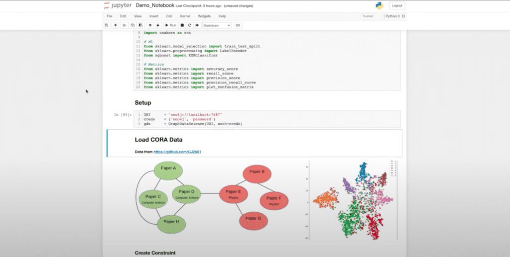
Now let’s run through this library or this notebook and talk about it one by one. I’m going to do some of my imports, then I’m going to establish my GDS object, which is like my driver. We’re going to be looking at a supervised classification use case for one of the standard work benchmark and data sets, which is the Cora data set.
For those of you who aren’t familiar with Cora, it’s a citation network of machine learning papers that are related to one another. And here you can see a rough diagram of the data. This is ultimately where we want to get: where we’re separating our data into different spaces, allowing us to classify the papers according to their labels.
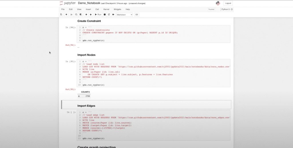
First, I’m going to load in the data. I’ve just created my constraint to limit the IDs within my database. Now I’m bringing in my nodes, (you can see this is a relatively small graph, about 2.7000 nodes) and bringing in my edges (another 5,000 edges). Now we’re in to generate my underlying projection.
(This is one of the things I love about the new driver. It allows me to create a projection object. Previously, some of you might have engineered this by hand where you essentially created a string and then did a graph.)
Now I can use my graph project function, pass it (the objects in question) and dynamically update them if I want. I’m going to run my projection and create it.

Now I have this very helpful graph object store in my variable G that I can do cool things with. I’ve created a quick little helpful function here that prints out a couple of the summary stats included on my graph object.
And here you can see I have the name of my projection. I have my degree distribution. I have the density node count, relationship count and all of that’s built natively into the graph object. I don’t have to write something that’s going to return those statistics. I can call it directly as a method or a property.
Neo4j GDS Results in Pandas DataFrame
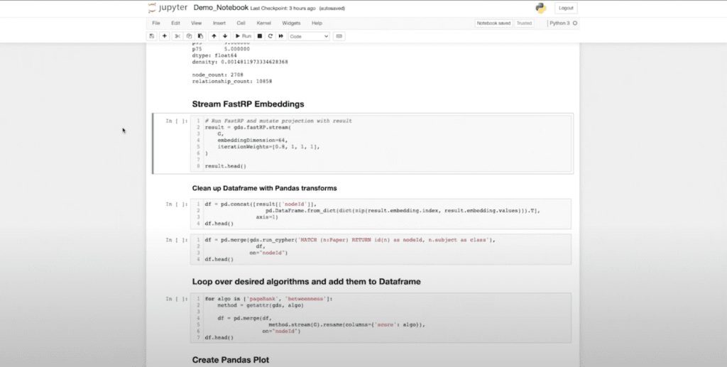
Next, we’re going to get into the actual knowledge graph machine learning part of things where we’re going to use FastRP again. One of the things I want to highlight is how the new driver integrates seamlessly with the workflows that we’re used to using as data scientists. As a data scientist, if I run something and you give me data back, I want it in a Pandas DataFrame.
So that’s my expectation if I’m using Python and Neo4j GDS. We’re going to use that as our standard lowest common denominator data structure to manipulate the data. And that’s what we’re seeing here.
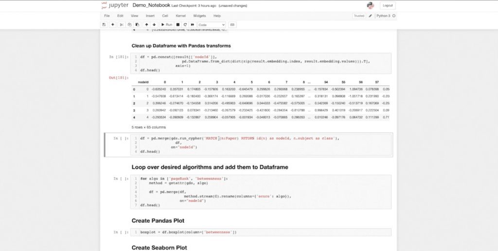
One of the things I can do now that my data is in this data frame is use the normal transformations I already know (that are native to Pandas) to start transforming my data. And here I want to unpack my columns. I have 64 embedding dimensions for my Cora data set. And you can see that I have my node ID. We have 64 embedding dimensions, which represent my graph. And this is in my nice Pandas DataFrame.
I want to emphasize that this now behaves like any other Pandas object. As does the data that’s returned from our run cipher function. Neo4j GDS has a convenient run cipher function. If you’ve used the previous Neo4j driver, you have to deal with things like sessions, open, close, etc.
We want to extract those things away from the data scientist. We just want to run cipher and get the results. We don’t want all of the session and have to deal with that.
So Neo4j GDS returns my results in a Pandas DataFrame as I would expect, and I can seamlessly use it in my merge function with my previous data frame.
Enriching Data and Aggregating Statistics
Next, I want to get the labels of my data because right now I don’t have my actual “y” variable, and I want to bring it into my data set. When I run this, I already have my class object natively populated in my data frame. And when you look at this, if you’re familiar with generic machine learning pipelines in Python, this is starting to look like a typical knowledge graph machine learning data set you might use with Scikit-Learn.
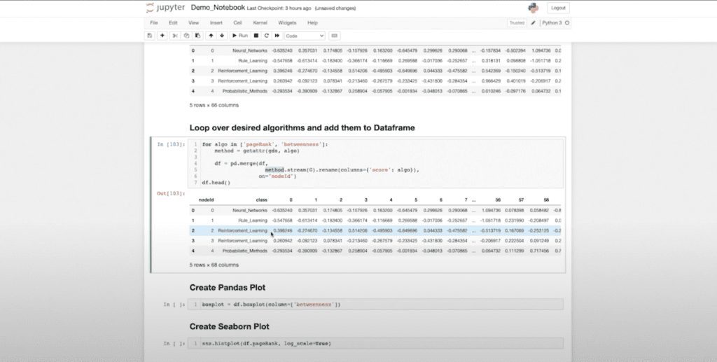
Now I might want to further enrich this data. For those who are familiar with machine learning workflows, something that’s very common is that we generate statistics in the graph. Then we feed those to a traditional classifier. I’ve done that up front with my FastRP embeddings, but now I want to further enrich that with my page rank and betweenness centrality measures.
I don’t actually need to call them individually. I can use my “get attribute” function because we’re in Python now. And I can simply loop over the statistics, which I want to collect and aggregate. So when I run this (again, because I know this will return as a Pandas DataFrame) it’s going to run it, return it in a data frame and join it to my data.
All of that I can do in just a couple lines of code. This is not the kind of thing I could have done without this driver. Or it would’ve required a lot of f-strings and formatting, so it honestly wouldn’t be worth it. Now I have my page rank and my betweenness stats natively present in my data frame.
A Deep Analysis of Statistical Outliers
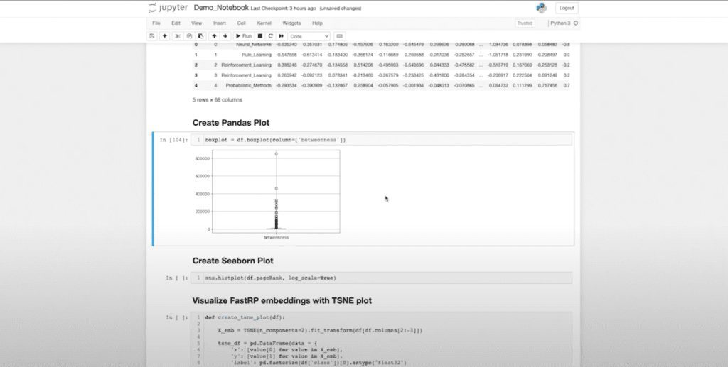
This is essentially my data that I’m going to work with. These are my “xs” and my “y”. Now that I’m in Pandas, I can perform a variety of data science tasks. I can start using some of the native functions within Pandas to produce box plots, for example. And here, I can actually see that there are some interesting statistical outliers. If I want to take a deeper look at this, I can use all of my normal functions.
Now this has already ordered my data frame. So if I want to investigate the outliers we can see in my box plot, I can automatically pick those out and see what classes they are. And I can actually say: My top five are of different classes, which might be interesting to me for whatever reason.
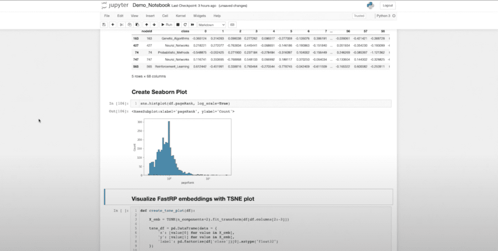
It’s not that this is particularly fascinating, but since I can do this, there are about 25 other things I can do. I can also take my data that I got from Neo4j and feed it into other Pythonic libraries. I personally really like Seaborn for a lot of my visualizations, and I can start generating visualizations using Seaborn. I can actually visualize that this is my page rank variable in a histogram.
Visualizing Embedding Dimensions in 2D
I can even visualize my embedding dimension. If I want a visual representation of how well I’ve embedded my data, I can create a TSNE plot to visualize the actual embedding dimensions in a 2D space. Now I can understand what my embedding dimensions look like when compressed in a 2D space.
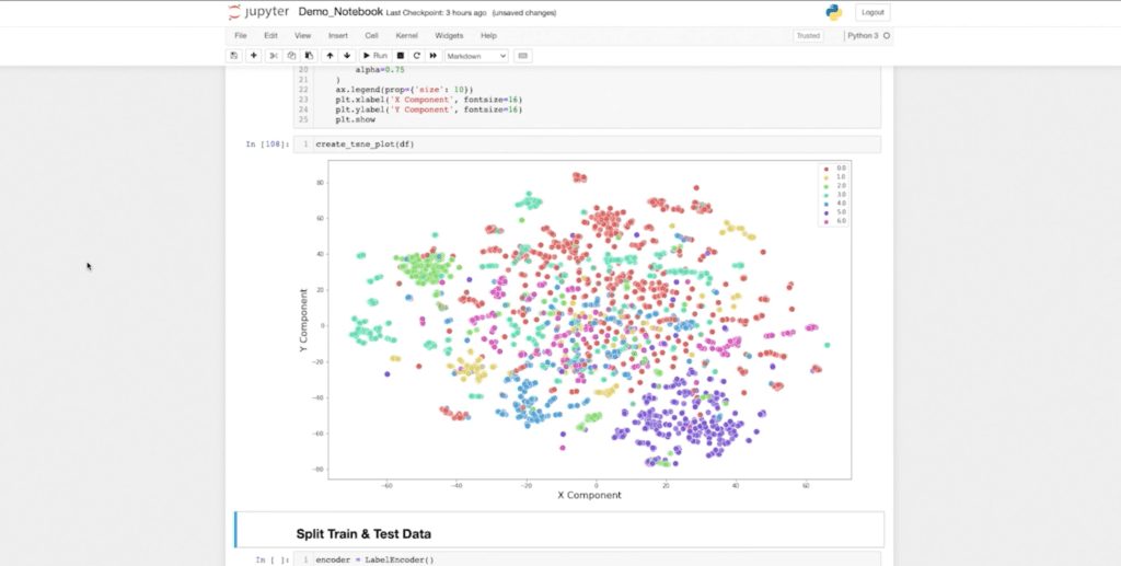
I can see my green class over here, and my purple class and blue class are fairly well clustered. It looks like my red class is kind of sparse. So we’ll see what kind of results we get from our classifier. But once again, this is just one more way I can seamlessly pull data from Neo4j and graph data science, and integrate with my normal machine learning workflows.
Everything from here on out is what we would typically expect from a Scikit-Learn machine learning classification use case. So I’m going to start by encoding my labels because I don’t want to have my label be neural networks. I want it to be a zero or a one. Then I can start doing my train-test split.
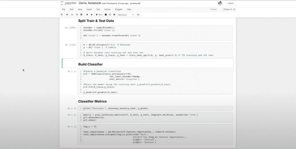
Applying XG Boost in Train-Test Split
Now I’m splitting. I’m doing a 30/70 split here. And now I have x Train – x Test / y Train – y Test. In this case, while Neo4j and graph data science are nice enough to offer logistic regression and random forest natively, which are great models, I might want to use other models that aren’t natively supported by graph data science. In this case, XG boost, which is one of the best classifiers we have today.
If I want to use the power of XG boost, this lets me quickly get value out of my graph into some kind of embedding space. Then I can pass that onto a model I wouldn’t have otherwise had access to in GDS alone.
I’m really merging my existing skills as a data scientist with the features Neo4j GDS offers. Now I can train my XG boost model, and we can start evaluating.
Evaluating Data Performance
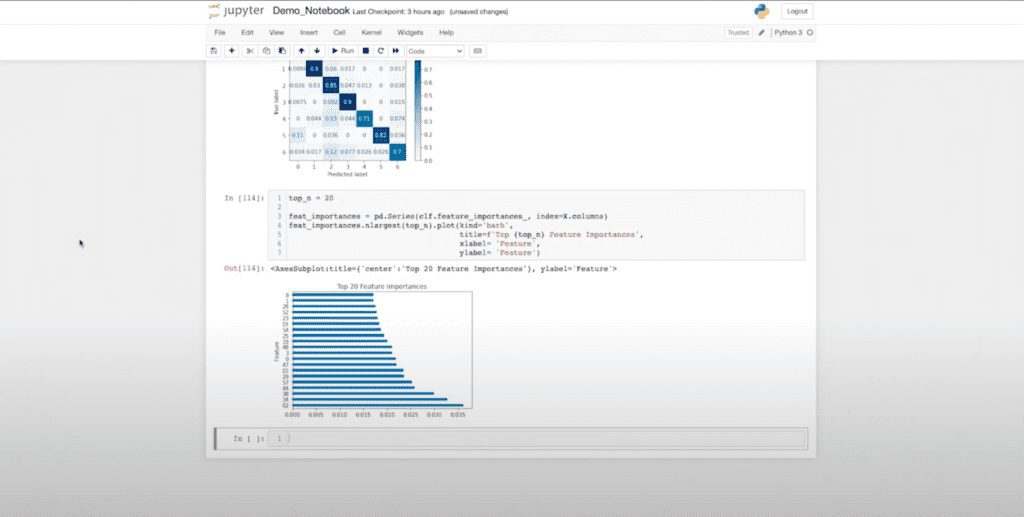
Let’s see how we did on accuracy: 81 — not terrible, not great. I can start creating confusion matrices. And we can start evaluating how my data performed and which classes I might be struggling with. I can also look at my future importance to see which of those embedding dimensions contributed to my classification and the underlying model.
Here you can see my 62nd dimension contributed the most, and there’s a pretty smooth curve. Another interesting note is that my page rank and betweenness are not present in the top 20 list, which tells me they might not be providing much information. This gives me feedback as a data scientist to perhaps go and rerun my hypothesis and understand what I might want to reevaluate.
Again, all this code is available on GitHub if you’d like clone it. And if you need help rebuilding a backend application, visualization, BI work, or knowledge graph machine and analytics, contact Graphable today.
If you are looking for more on graph NLP-related topics, check out our natural language is structured data article, or our post on the order of steps in natural language understanding.
Graphable helps you make sense of your data by delivering expert analytics, data engineering, custom dev and applied data science services.
We are known for operating ethically, communicating well, and delivering on-time. With hundreds of successful projects across most industries, we have deep expertise in Financial Services, Life Sciences, Security/Intelligence, Transportation/Logistics, HighTech, and many others.
Thriving in the most challenging data integration and data science contexts, Graphable drives your analytics, data engineering, custom dev and applied data science success. Contact us to learn more about how we can help, or book a demo today.
We are known for operating ethically, communicating well, and delivering on-time. With hundreds of successful projects across most industries, we thrive in the most challenging data integration and data science contexts, driving analytics success.
Contact us for more information: