CONTACT US
Exploring Bike Share Data With Uber H3 Grid System and Hume Geospatial Analysis [Video]
In this expert talk, Graphable Lead Data Scientist Sean Robinson leads us through a geospatial analysis using Uber H3 grid system and Hume (GraphAware) geospatial analysis. We’ll visualize bike traffic routes by time and location, which can support city planning efforts to build new routes, making commuting easier for New Jersey residents. Follow this link to read an introductory article on graph database geospatial analysis.
Watch the video below or read the transcript to explore how data can be displayed within specific temporal and geographic contexts with Uber H3 geospatial indexing.
Video: Uber H3 Hex Grid System and Hume Geospatial Analysis
Transcript: Uber H3 Grid System and Hume Geospatial Analysis
Today, we’re going to look at a geographic neo4j use case of the Hume knowledge graph platform by exploring city bike data with the Uber H3 geospatial index.
If you’re not familiar, public bikes are available in most major cities, and we have public data for many of these bikes. In particular, we’re going to assume the role of city planner for the day by seeking to understand how different bike routes might be needed in certain parts of they city.
My data model involves a few simple elements. I have rides, which start and end at some station. And within a particular station, I have either a total number of rides between two
stations or a total number of rides per day in the station.
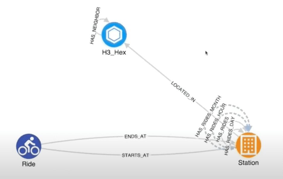
We’ve also used the Uber H3 grid system to understand which stations are located in a particular hex. We have this located in relationship with a given H3_Hex, and these hexes have neighbor hexes.
We can also use Hume’s perspective feature to implement things like virtual relationships. In this case, I have multiple aggregations of the same data across different time intervals.
I can also use virtual relationships to either calculate rides per month, rides per hour or whatever might make sense for my given use case. Today, we’re just going to use “HAS_RIDES_DAY”.
Enabling Geospatial Settings in Hume
Next, I’m going to access my visualization, and I have a simple schema. I’m going to start by enabling the geospatial setting. In particular, we’re focused on traffic between Jersey City and Hoboken.
I’m going to start by overlaying my hexes on my Uber H3 map grid. Now I can see which hexes are where. I’ll additionally add my hex nodes, which are generating this underlying Uber H3 hex grid.
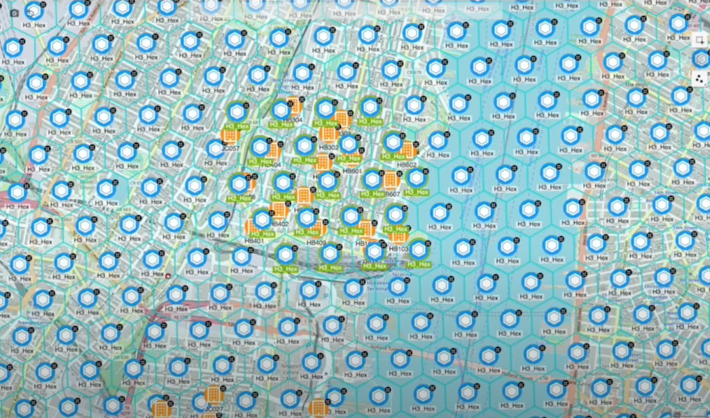
Now let’s get our hexes. We have a H3_Hex for every single hex on our map. I’m going to use these to find the stations that are most relevant to our use case. Specifically, I’m going to select an area in Jersey City, and we’re going to get the stations for it. Then I’m going to move into southern Hoboken and grab the stations there.
Setting Up Bike Traffic Visualization
Great! Now that we’ve done that, I don’t need my Uber H3 hexes anymore. I can remove them in a couple of different ways. I could simply toggle them off of my screen. However, making them toggle-able would consume resources, and I want to be as efficient as possible. So in this case, I’m going to remove them from my visualization, which I’m not worried about because it’s easy to get them back if I want to look at them again.
Now I have my stations, and I want to focus mostly on the south. I want to understand the various bike traffic scenarios across all of these stations and within a given area. So I’m going to select all of my stations, and I’m going to use my “Get Ride Days” action to calculate all of the rides between any two stations and retrieve the data in a way that will be nicely visualized.
Right now, Hume is reaching out to Neo4j to calculate the data and bring it back into the visualization so we can look at it more analytically.
Filtering Data by Time Slice
The visualization is a bit of a mess at first because it’s showing all of the days for the stations. So I want to filter this down based on a temporal element.
Here I have my temporal analysis section where I’m going to use my “Time-slice” by day, so I have my time bar enabled. Now I have a given days’ worth of data for any given slice. If I’d like, I could turn this off and get down to the individual hour or minute. But today, I’m only interested in a day’s worth of traffic.
In particular, this data is for Jan. 1 through Jan. 31, 2022. Let’s go ahead and take a look at Jan. 1. This is New Year’s Day, so it’s probably an outlier when trying to understand how traffic patterns arise in this part of the city.
Analyzing Traffic Patterns Across Bike Stations
We can see some heavy traffic from the southern region into stations 101, 103 and 105. We can also see some traffic moving toward the 401 and 402 areas. But now, let’s kick off our time bar and see how the traffic pattern evolves over time.
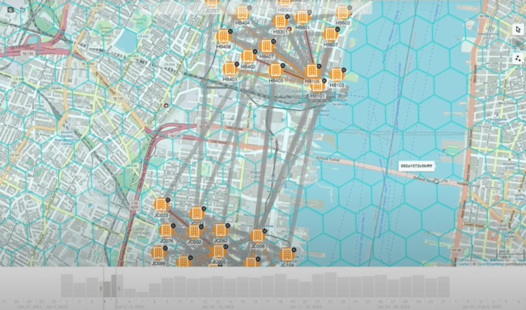
We can see quite a decent amount of traffic moving across from Jersey City to 101. We can also see some traffic in the 408 and 401 areas. It looks like traffic is moving both northeast and a bit northwest.
Now we’re seeing more traffic toward 101, so at this point I’m wondering: What am I seeing here? What does this pattern mean? And why is this 101 terminal so significant? I’m going to zoom in and take a look.
One of the first things I notice is that this terminal is closest to the Hoboken Ferry terminal. Since we’re in Jersey City, that makes sense because many people are using the Hoboken Ferry terminal to commute to Manhattan. Let’s try to further verify our hypothesis by using some other analytics.
This is where we believe a knowledge graph is an excellent way to analyze data, but we don’t believe it’s the only way. Knowledge graphs are most powerful when used in conjunction with other analytics methods, including something as simple as some traditional charting.
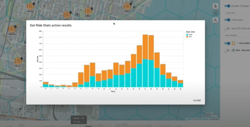
Now we’ve built this in so we can get a distribution of ride volume across different hours of the day. And for our Hoboken Ferry terminal, that makes a lot of sense. We see a lot of rides ending early in the morning and starting late at night. That tracks with our hypothesis that many people are taking a bike to the terminal so they can get work. Then they return and start their bike ride home.
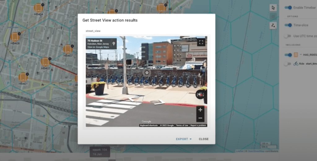
Beyond that, one of the things we’ve found that is very useful, especially in geographical cases, is getting boots on the ground to form and evaluate hypotheses. In this case, we’ve integrated a Google Street View via an iframe. That allows us to dive into a given area and take a look.
Examining Potential Traffic Issues With Hume
Now I can actually see the individual bike terminal here, which I can visually investigate. For example, perhaps I have an issue. The terminal could be inaccessible or there could be a major event nearby. In that case, I can see that there are a couple of car parks nearby, which is good. There are plenty of crosswalks available to access, and there are no streetlights, so I’m going to say this checks out.
I can repeat this analysis for any given terminal. 401 stood out as a particularly active terminal, so let’s take a look at that. We can use our street view here. Once again, we can see our bike station. Overall, it looks pretty good. I can also repeat the same kind of analytics. I can get statistics on my rides, and we get a similar kind of distribution. Very cool!
Using Traffic Visualizations for City Planning
Now that we’ve looked at the various data points behind these traffic terminals, let’s take another look at our traffic to see where we might want to build these bike routes. I’m going to go through a few more days of traffic, and once again, 101 is surfacing most of the traffic.
At this point, I feel confident knowing where I want to build. I think most of what’s happening is that I have traffic moving south from Jersey City into Hoboken so the bike riders can take the ferry across.
I don’t think this is a case where I need many new bike paths. It seems there are only a few primary destinations here, which are the 101, 103 and 401 terminals because some people are also traveling to the west side of Hoboken.
In this case, I want to pick a happy medium. I know I can’t build a route directly to HB 101 because there’s this nice train yard and part of the Hudson in the way. I also want to make sure I’m directing some traffic to 401. So I’m going to pick something in the middle, which is this 409 station. I want to connect to connect it something central, which would be this JC82 terminal. That will give us a nice direct route from central Jersey City into Hoboken.
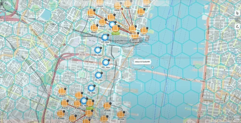
Next, I’m going to use my underlying H3 hexes and build the shortest path between these two stations. What we get is the H3 path for these stations. Now I know exactly where to build my path. I can see there’s a main thoroughfare we can use to build a route between the two.
I hope this has been a helpful look at how you can use H3 Uber with Hume’s features to solve your geospatial graph problems. Also read this related article on graph analytics.


